KipStrix
Consistency, made visible
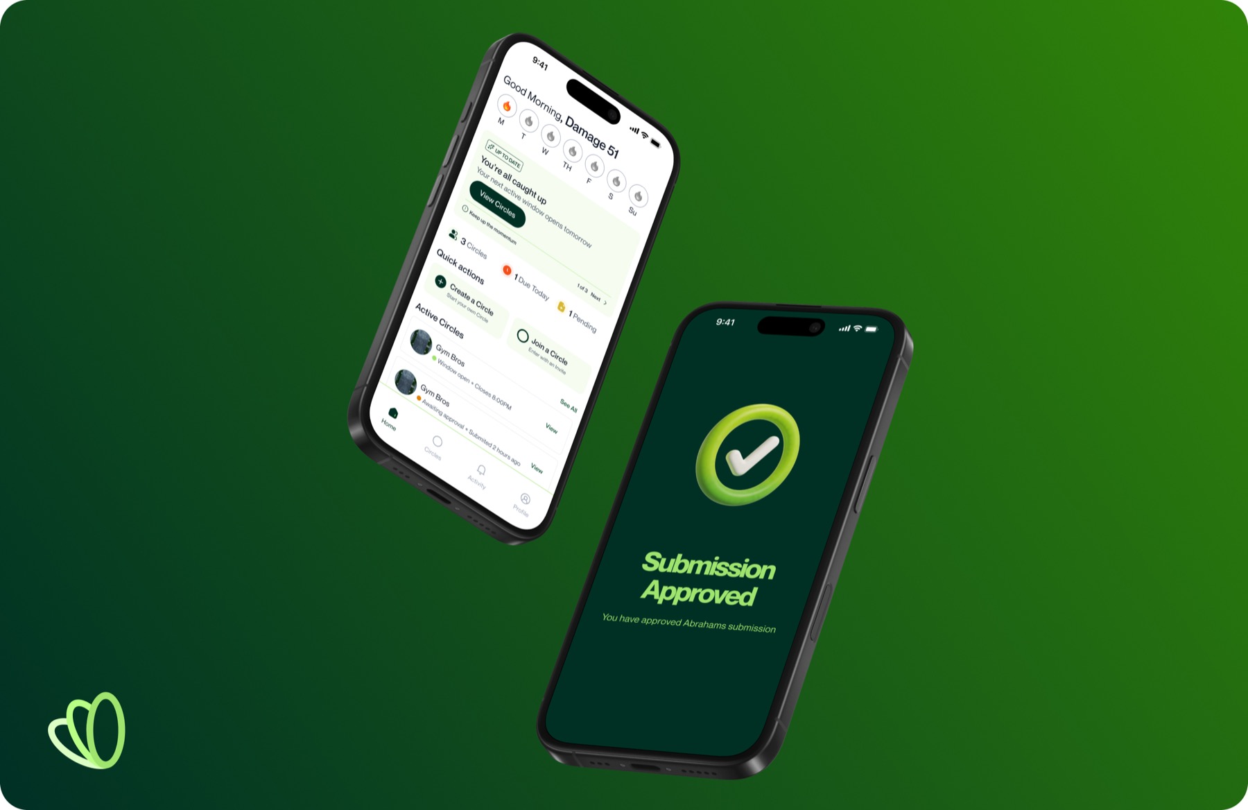
I designed the brand, mobile product, and design system for KipStrix, a social-accountability product built around visible, time-bound commitments. The brief deliberately rejected backdating and streak repairs, so my challenge was to make strict accountability feel clear, fair, and human rather than punitive.
Click to expand
The Brand
The Logo
Color
Typography
Click to expand
Overview
A Circle turns a private intention into a shared, inspectable commitment.
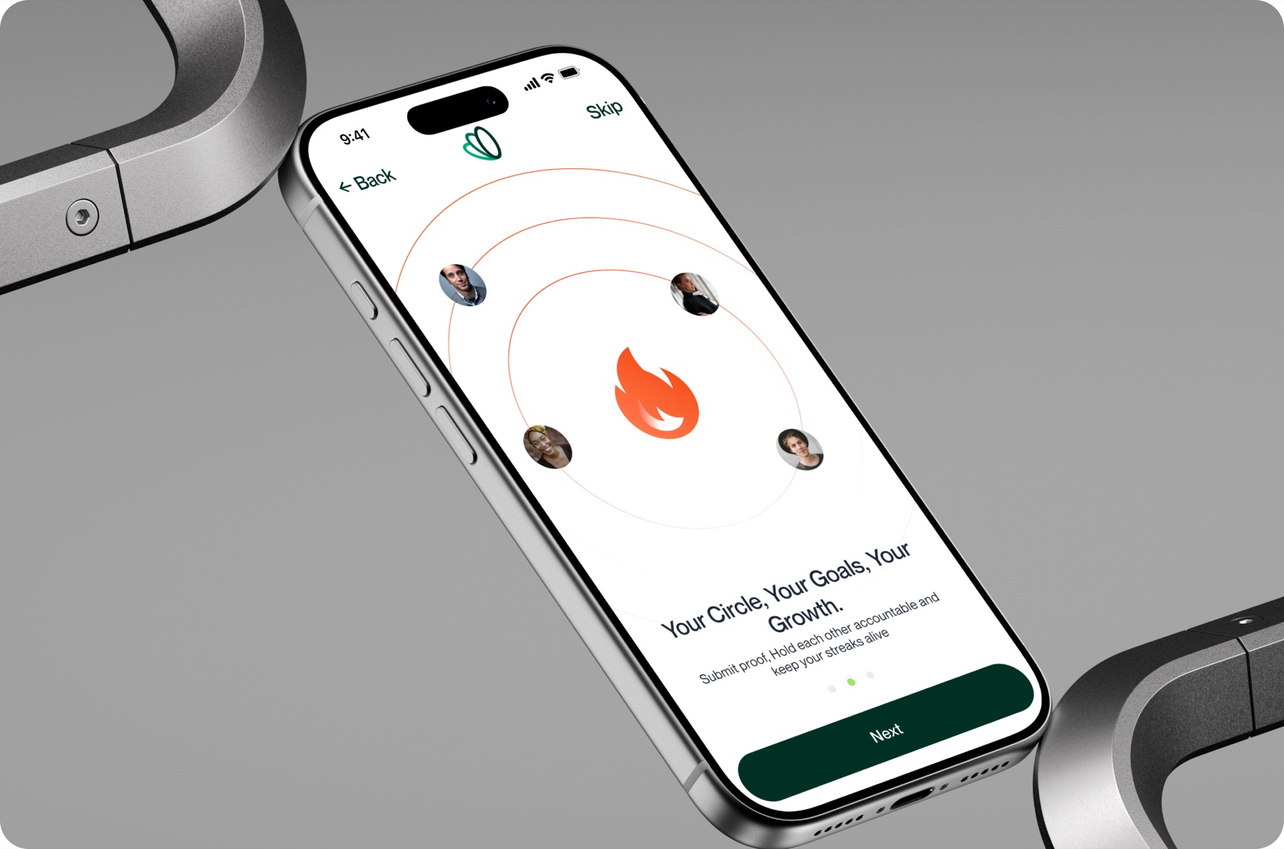
KipStrix is organised around Circles: groups formed around a shared goal and led by an Anchor. Each Circle makes the agreement explicit: how often members submit, when the submission window opens and closes, what counts as proof, and how that proof will be verified.
Verification can be automated, handled by a minimum number of group members, or assigned to the Anchor. A streak belongs to a member inside a specific Circle, so progress is attached to an actual commitment rather than a generic count on a profile.
The product position is intentionally narrow. KipStrix is not trying to make every goal feel easy. It is for people who accept that a commitment has a deadline, a witness, and a consequence when it is missed.
Problem
A streak means little if yesterday can always be rewritten.
The brief began with a strong product belief: motivation is temporary, while accountability needs structure. In many self-tracking experiences, completion is private, deadlines remain negotiable, and a missed day can be repaired after the fact. The record survives, but its meaning becomes weaker.
Simply making the product harsher would not solve that problem. A strict system can quickly feel arbitrary if people do not understand the rule, the deadline, the evidence required, or who has the power to approve or reject their work.
Research & Definition
I translated a strong point of view into a product model that could be examined screen by screen.
The documented discovery work combines client direction, the product brief, brand and persona development, product-model mapping, and repeated critique across the mobile flows. It established the intended audience and the non-negotiable rule: when a member misses the commitment, the current streak resets. There is no grace period, freeze, or backdating in the initial product direction.
The surviving project record does not establish participant counts, recorded usability sessions, product analytics, or launch outcomes. I therefore treat the conclusions below as working design principles rather than validated customer findings. The owners saw strictness as a way to focus the product on highly committed people; that remains a product hypothesis to test, not a proven retention strategy.
The resulting model gave each concept one job:
Accountability needs a closing moment
A deadline becomes credible only when the interface changes state and the action is genuinely unavailable after the window closes.
Evidence needs visible ownership
Members need to know what counts as proof, who will review it, and what happens after it is submitted.
Strict rules still need humane feedback
Resetting the current streak does not require the product to pretend that every earlier day of effort disappeared.
Brand Direction
The identity had to make discipline feel alive, not punitive.
KipStrix is positioned around demonstrated consistency rather than private intention. The line "Consistency, made visible" became a bridge between the brand and the product: a promise that had to appear not only in campaign language, but also in deadlines, proof, review states, and streak behaviour.

Consistency as a connected loop
The mark uses interconnected loops to express repetition and shared progress. Its forward lean introduces momentum, while the implied centre behaves like an anchor point: a visual reference to the role that holds a Circle together.

Two greens, told as a sequence
Fresh Lime represents the optimism of starting: joining a Circle, making the commitment, and taking the first visible step. Deep Forest represents what comes after motivation: structure, discipline, and progress sustained over time. Mint Mist creates quieter supporting surfaces; Energy Flame signals urgency and error; Golden Sun marks milestones and earned progress.
Three voices with clear boundaries
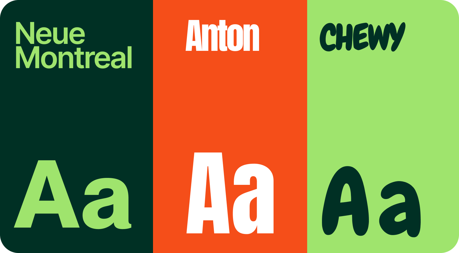
Neue Montreal is the intended product and body typeface: neutral, legible, and calm under dense information. Anton gives high-impact statements a decisive voice. Chewy introduces warmth in celebratory or expressive moments, but is kept out of long-form text and core interface work.

A brand system that can enter the product
Loops, colour, type, iconography, and 3D imagery were designed as reusable behaviours rather than isolated campaign treatments. The identity is most convincing when the same logic survives onboarding, Circle creation, submission deadlines, review states, resets, and milestones.
The brand promise becomes credible only when product behaviour makes it true.
Product Design
The interface enforces commitment through state, not motivational copy.
The product needed to answer five questions at any moment: What did I agree to? What can I do now? When does that opportunity close? Who decides whether the proof counts? What happens next?
01Make the agreement explicit
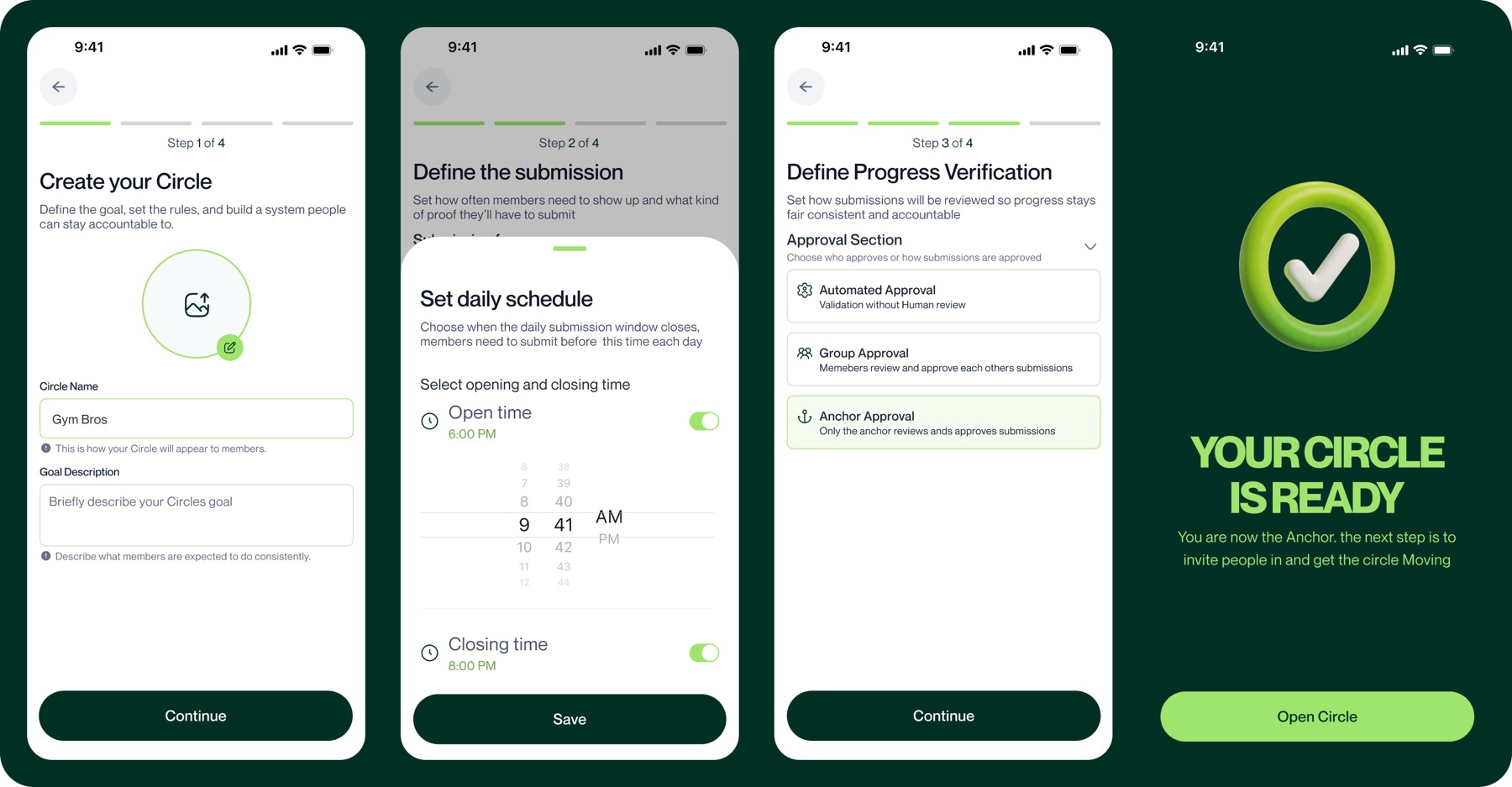
Creating a Circle is deliberately staged. The Anchor defines the goal, cadence, submission window, proof type, verification model, and membership before inviting people into it. The added setup cost gives every future state a rule the product can point back to.
02Put one next action on Home
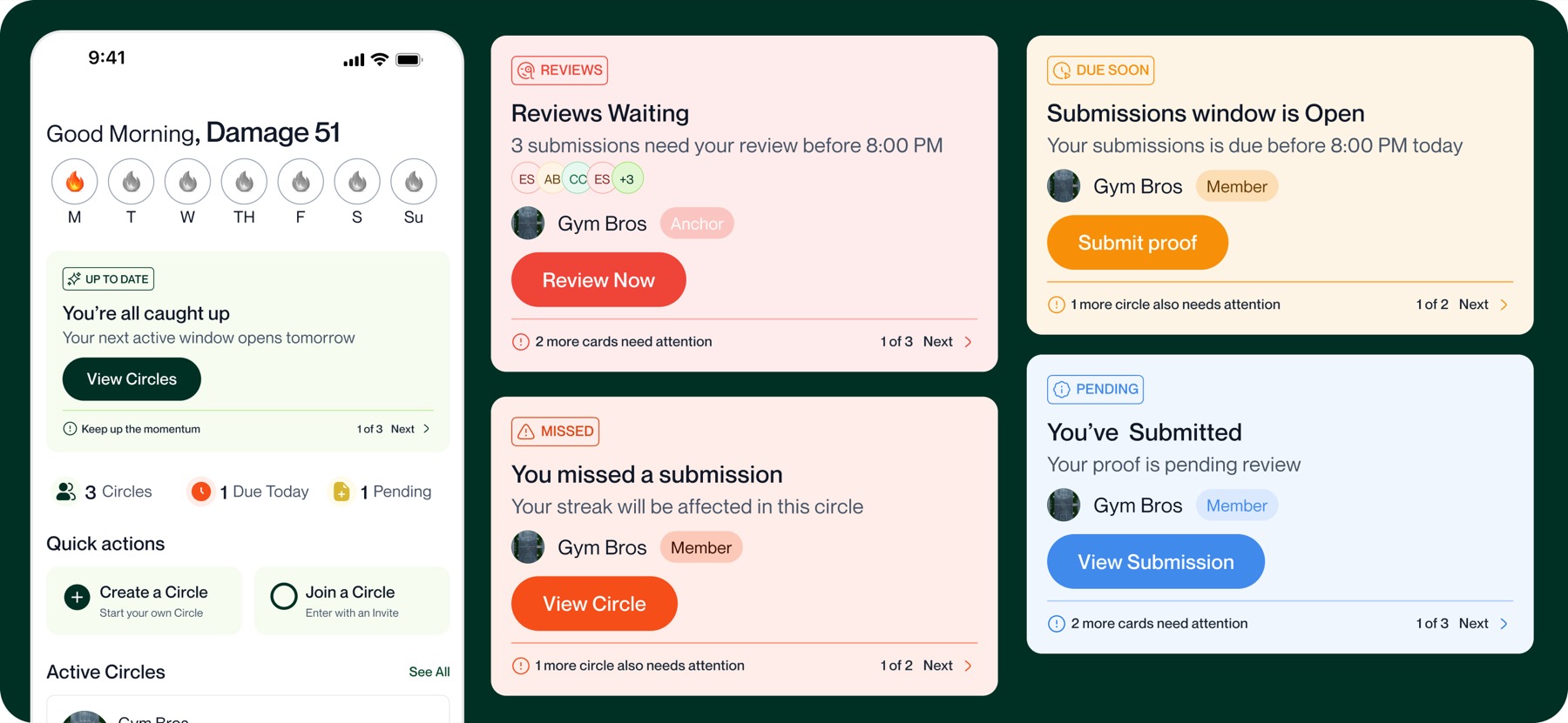
Home uses five status cards: Reviews, Due Soon, Missed, Pending, and Up to Date. Each card carries one state, one colour, and one primary action. The system detects what needs attention and gives the member or Anchor a clear decision rather than a generic dashboard of activity.
03Make the window impossible to misunderstand
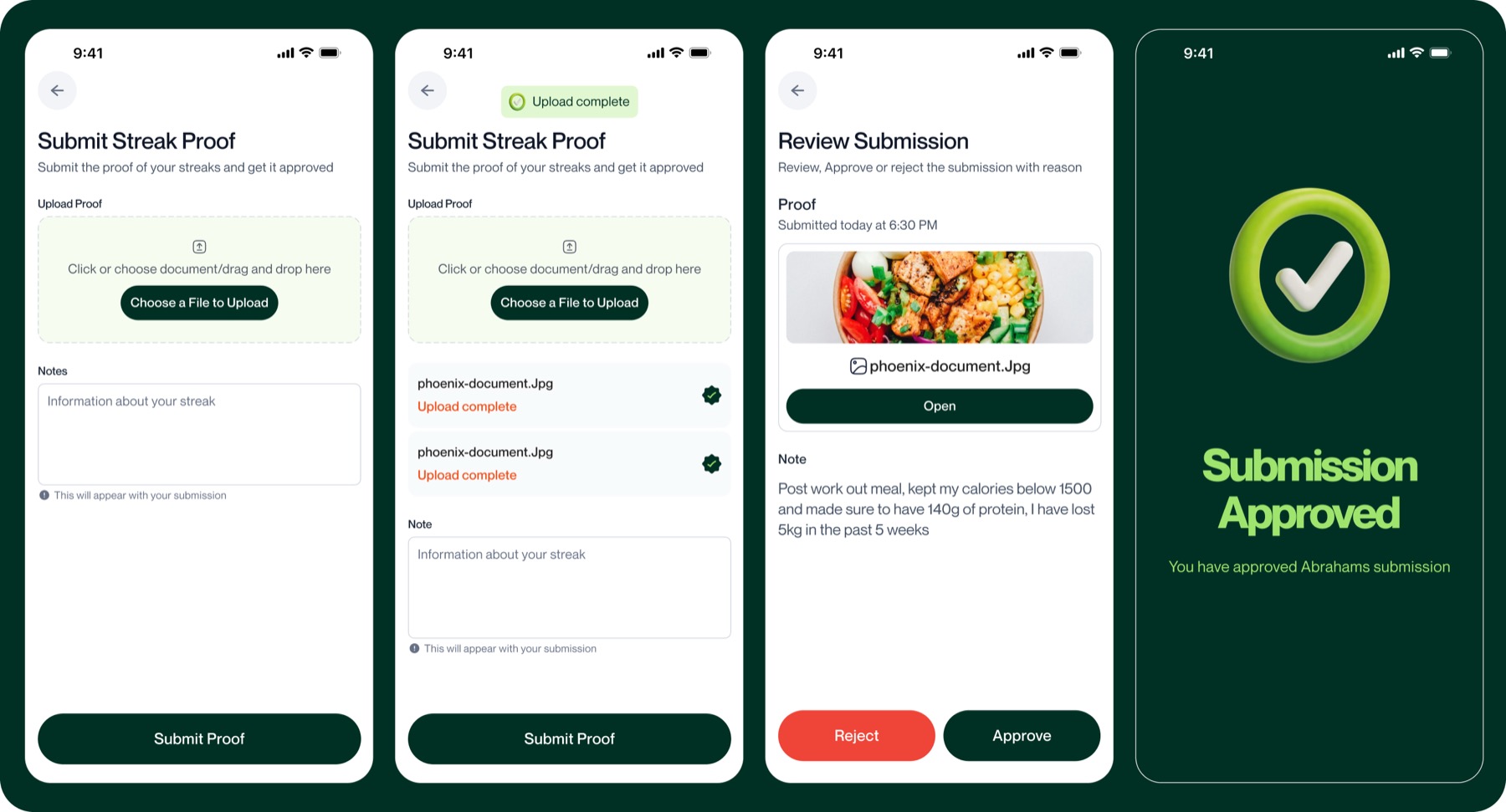
The submission experience moves through open, submitted-and-pending, and closed states. A countdown is tied to the deadline. When the window closes, the submit action is disabled; the product explains when the next window opens instead of offering a hidden repair path.
04Make verification accountable
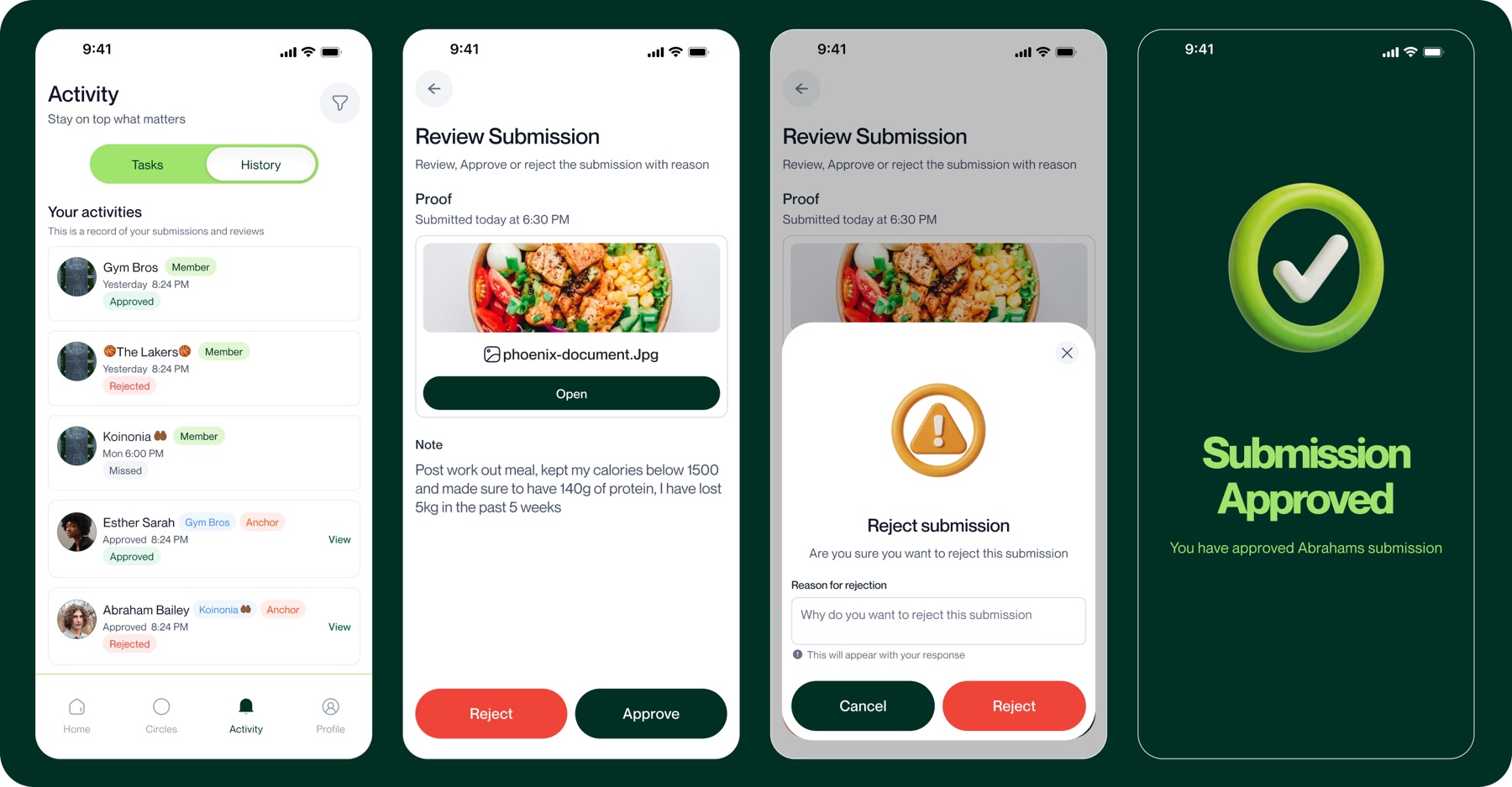
Proof can be accepted automatically, approved by the group, or reviewed by the Anchor. The selected model is visible before submission. When a human rejects proof, the interaction requires a written reason so that authority does not become an unexplained red state.
05Reset the count without erasing the effort
The current streak still returns to zero after a missed commitment. The reset state also preserves the previous best (for example, "Previous best: 14 days"). That information does not soften or reverse the rule; it acknowledges that the earlier consistency actually happened and gives the member something concrete to rebuild toward.
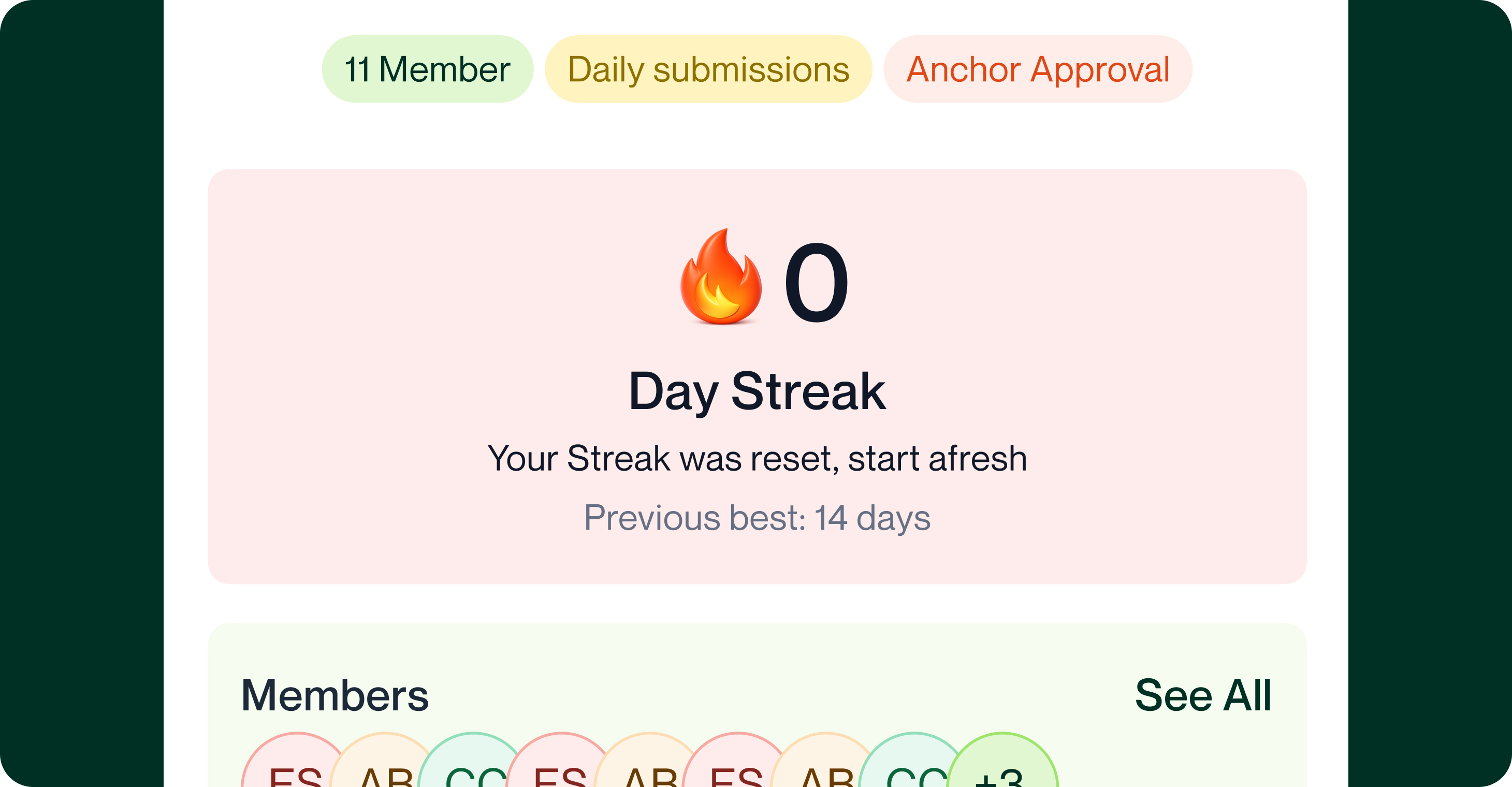
KipStrix does not rely on encouragement to simulate accountability. It makes the agreement, window, evidence, reviewer, and consequence visible in the interface.
Design system
Brand and product were built together so the same rules could survive repetition.
The Figma foundation contains 77 paint styles, 33 text styles, and 14 effect styles. The colour library includes ramps for brand green, orange, yellow, status colours, greys, and supporting backgrounds. The type styles cover 11 roles across Regular, Medium, and Bold. Shadow and blur styles support both light and dark contexts.
The system gives recurring product states a consistent language: Deep Forest for structure and primary emphasis, Fresh Lime for active commitment, Energy Flame for errors and urgent warnings, Golden Sun for milestones, and Mint Mist for quiet surfaces. Spacing, radii, elevation, and motion tokens carry the same logic into the development scaffold.
The system is also an honest record of where I was at the time. The Figma file is built primarily with local Styles and currently has only a minimal variable setup, rather than a complete semantic token architecture with modes and code mappings. That was workable for one designer; a team-ready revision should separate primitives, semantic aliases, and component tokens, then name components for handoff rather than for personal recall.
The intended primary typeface is Neue Montreal, while the current app scaffold uses Inter as a temporary substitute until the licensed font is available. The repository verifies an early mobile/authentication scaffold and an initial data model for profiles, Circles, membership roles, and streaks; it should not be presented as proof that every designed submission and verification behaviour has shipped.
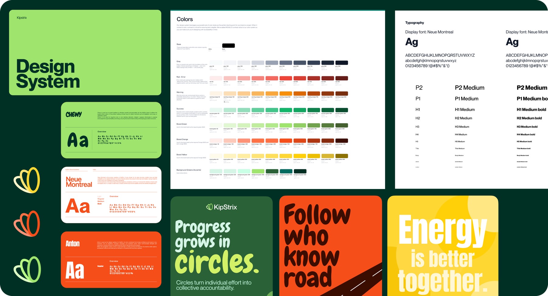
77
paint styles
33
text styles
14
effect styles
124
shared Figma styles in total
AI in my workflow
AI accelerated the expressive layer; the interaction logic remained designed.
I used ChatGPT to translate the brand guide into repeatable visual constraints, then used Seedream to generate a family of 3D assets from those prompts. Instead of prompting each image from scratch, I treated the prompt like a token: encode palette, material, lighting, form, and tone once, then reuse the rules to reduce stylistic drift.
The assets appear in expressive, low-risk surfaces such as information screens, modals, and empty states. They do not decide hierarchy, submission rules, approval logic, or critical interaction states. I still selected, art-directed, and placed the outputs inside the system.
AI helped produce variation quickly. It did not validate the product, establish customer preference, or replace product judgement.
I used generation where visual variation was tolerable and kept consequential product behaviour deterministic.
Outcome & Reflection
The result is a coherent product direction; customer and business impact remain unproven.
KipStrix now has one connected expression across brand identity, the mobile experience, and a focused launch site. The work defines the Circle and Anchor model, three verification approaches, the important submission and review states, five Home priorities, and a visual foundation that can move from promotion into the product.
The product is still in development. The documented evidence does not establish launch, adoption, retention, usability improvement, or business results, so I do not use those claims here. The measures below describe design coverage, not customer impact.
3
connected disciplines: brand, product, and design system
3
verification modes: automated, group, and Anchor
5
Home status states: Reviews, Due Soon, Missed, Pending, Up to Date
124
shared Figma styles: paint, type, and effects
The hardest part of the work was not making KipStrix strict. It was deciding how a strict product remains understandable and fair. The previous-best state became the clearest example: the rule still resets the present, while the interface refuses to erase the past.
The project also changed how I think about systems. A large style library is not automatically a mature design system. The next version should be organised around semantic variables, clearer component names, interaction documentation, accessibility states, and direct code mappings.
The next step is validation with the people KipStrix is intended to serve. I would test whether strictness feels credible or punitive, whether members understand submission windows and approval ownership before joining, whether group and Anchor review feel fair, whether "previous best" supports recovery without weakening the rule, and what privacy, moderation, time-zone, and appeal safeguards the proof system needs.
The central lesson was simple: a brand promise is strongest when it can be found in the product's behaviour, not only in its presentation.