FleetCore
From disconnected fleet signals to coordinated action
I designed FleetCore to help fleet managers move from a warning to an accountable operational response without losing the vehicle, driver, trip, location, or maintenance context behind it. I began by building a variable-led design system in Figma, then used that foundation to shape a connected product around one operating model: Detect → Investigate → Decide → Act → Monitor.
Overview
The brief described an entire fleet platform. The product needed one operating logic.
The work began with an Integrated Fleet Management System brief covering vehicles, drivers, tracking, fuel, maintenance, documents, and analytics. That breadth helped establish the domain, but it did not create a coherent product. A fleet manager does not experience an incident as a set of separate modules. They experience one problem that can cross several parts of the operation at once.
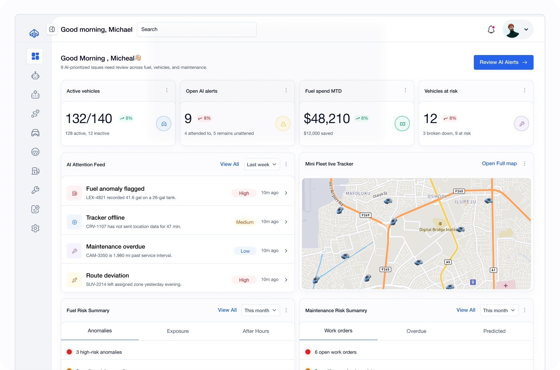
For this I focused on the Fleet Operations Manager experience and refer to the design as FleetCore. Dashboard, Fleet Map, Vehicles, Drivers, Maintenance, and Trips remained important, but each gained a clearer role around the central operational experience: AI Alerts.
The goal was to help an operator understand what requires attention, examine the evidence, make a responsible decision, take action, and monitor what happens next.
Problems
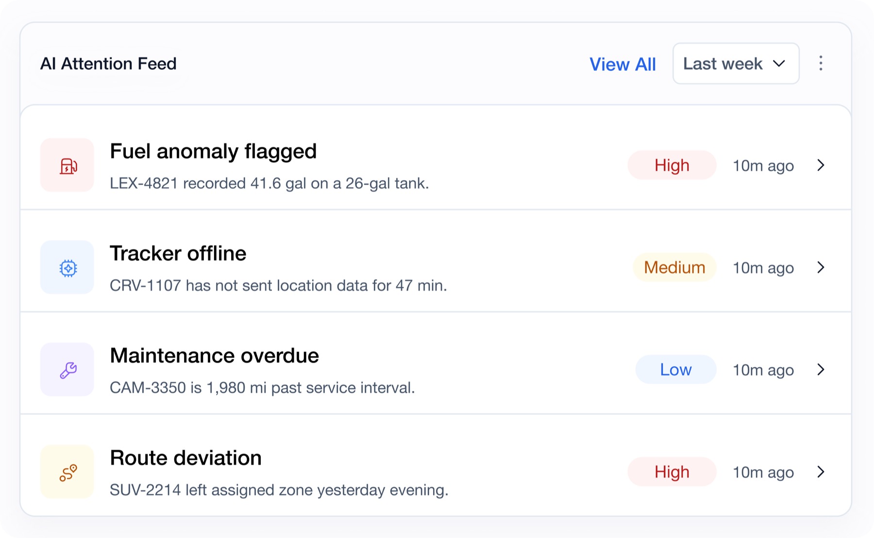
The challenge was not a lack of information. It was the distance between a signal and a decision.
FleetCore was not short on information; the problem was how fragmented that information became during an incident. A single fuel discrepancy could involve an alert, vehicle, driver, trip, location, and maintenance record, yet a module-based structure would force operators to visit each area separately and reconstruct the context themselves.
The alert experience also risked presenting AI-generated flags as definitive conclusions. Labels such as "fraud detected" concealed the evidence, uncertainty, and possible alternative explanations behind a warning. Because these decisions could affect people, costs, and operational records, operators needed to understand why an issue was flagged while retaining responsibility for the final decision.
The breadth of the original brief created another risk: designing every module and persona without first proving the core operational journey. Actions such as contacting a driver or creating a maintenance work order could easily become disconnected from the incident that triggered them. The challenge was therefore to create one continuous, evidence-led workflow that moved operators from detection to investigation and action without repeated context switching.
The deeper problem was not the number of screens. The product could tell a manager that something happened without providing one clear, evidence-led path for deciding what to do next.
Research
I treated the requirements as domain evidence, not as proof of user behaviour.
My starting evidence was the supplied UI/UX brief and business requirements document. I reviewed their modules, roles, entities, operational scenarios, and expected actions, then mapped how one issue could move across the system.
The source material contained valuable fleet-operation constraints, including fuel-card custody, tracker and location gaps, paper maintenance records, auditability, appeals, and mandatory human review. Some of its figures and statements were internally inconsistent, so I used the documents to understand the problem space and establish design constraints — not to claim validated customer needs, production performance, or achieved business impact.
The documented work available supports requirements analysis, workflow and entity mapping, interface exploration, interface-pattern exploration, and iterative design critique. It does not yet establish recorded customer interviews, formal usability testing, or product analytics.
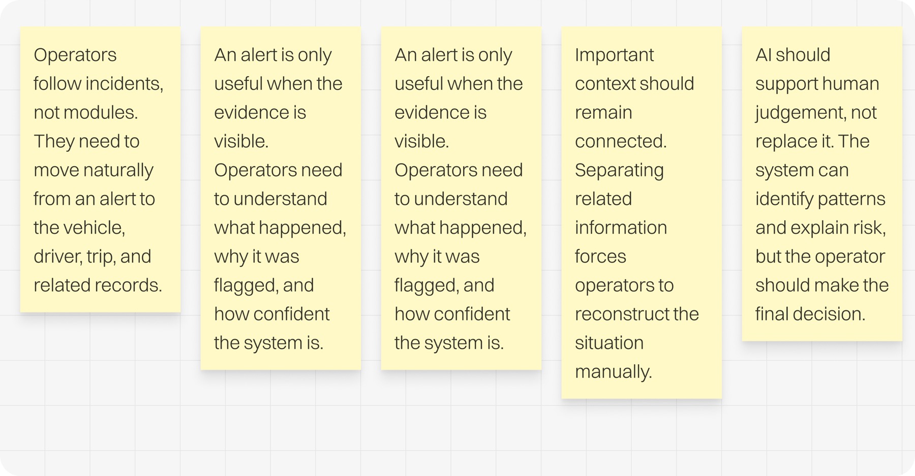
A shared decision model gave every surface a purpose.
Explorations
The most useful explorations revealed what the product did not need.
I used early screens and AI-assisted prototypes to test competing product assumptions. The work was not simply about improving visual polish. It was about deciding what FleetCore should expose, what could remain in the background, and where a human needed to stay in control.
01From one-off screens to a reusable product system
Designing each module independently might have made the first screens faster to produce, but the product would accumulate visual and behavioural differences as it grew.
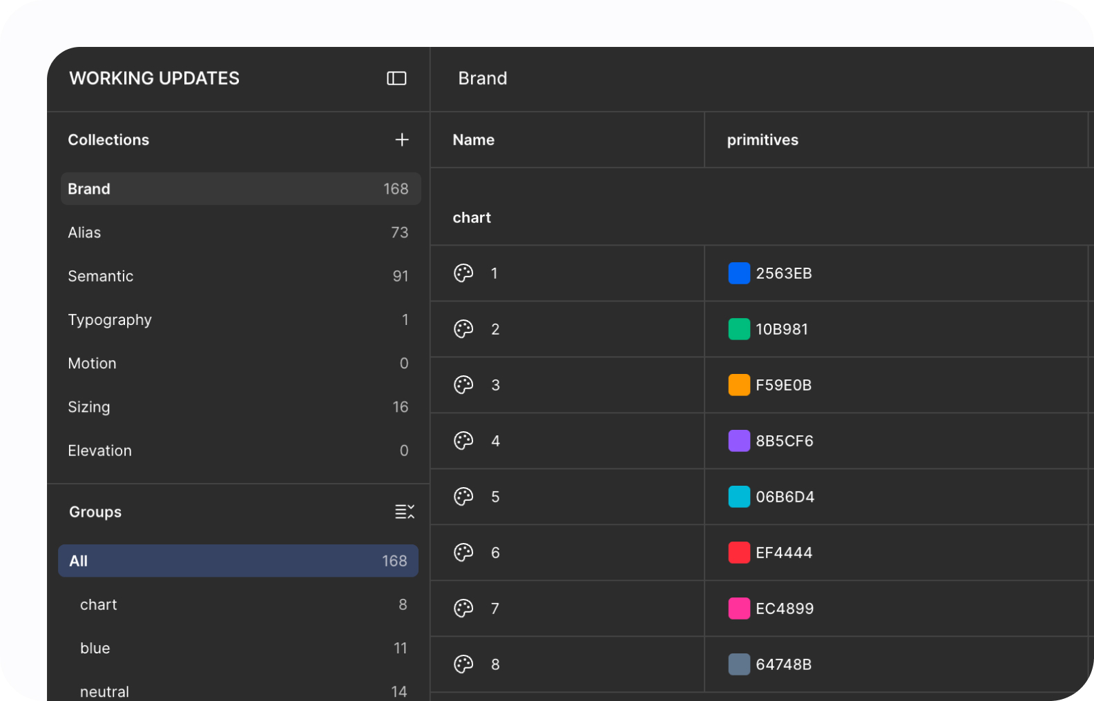
I created the variable and component foundations first, then composed the operational screens from them. This made consistency a design constraint from the beginning instead of a clean-up exercise at the end.
Shared foundations did not make every module identical. Tables, tags, controls, drawers, and feedback patterns remained predictable, while Fleet Map, AI Alerts, Maintenance, and Trips retained the specialised behaviour their domains required.
Selected, the design system became product infrastructure, not a retrospective component inventory
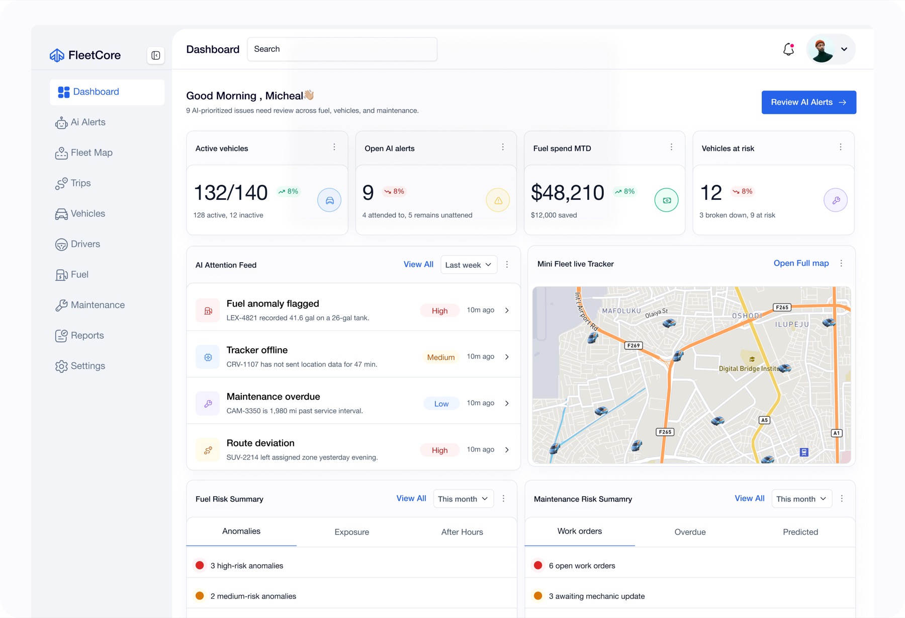
02From module-first navigation to a decision-led journey
The broad brief initially encouraged a conventional enterprise structure: a dashboard followed by a collection of equally prominent modules. That model made the system easy to catalogue, but it did not establish what the operator should do when a problem appeared.
I kept the Dashboard as the orientation layer and made AI Alerts the operational centre of gravity. The surrounding modules became places to inspect or manage an entity, while alerts connected those entities during an incident.
This reframed the product from "Here are all the things FleetCore contains" to "Here is how FleetCore helps someone reach a decision and act on it."
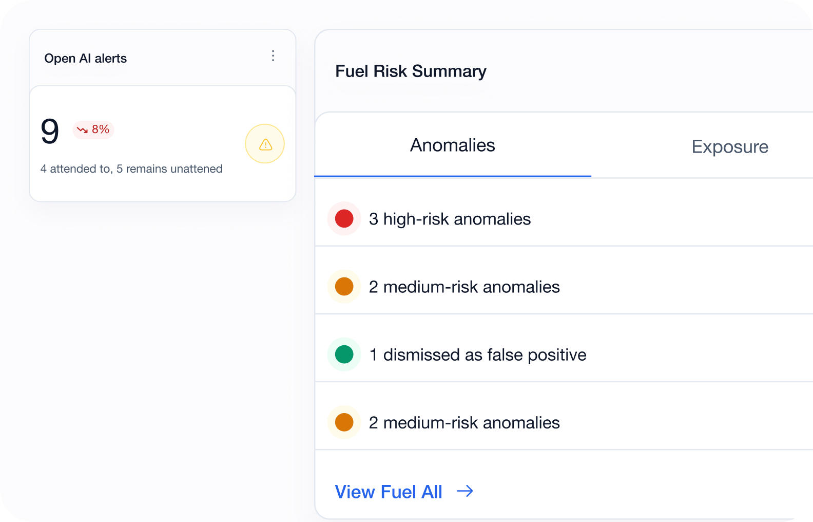
Selected, the Dashboard provides orientation; AI Alerts initiates the primary operating loop
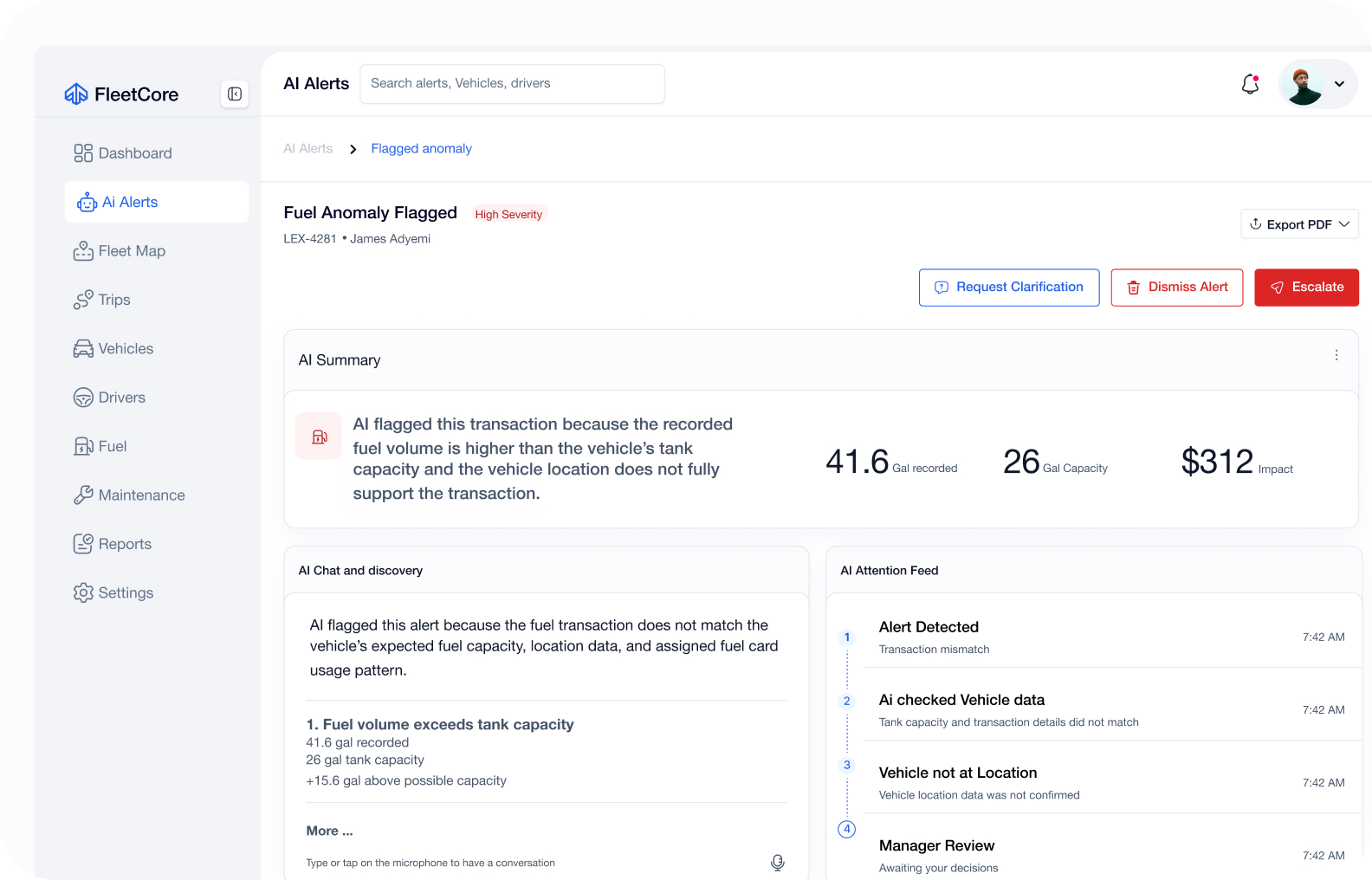
03From confident verdicts to explainable investigation
Early alert concepts risked turning an AI classification into a verdict. Definitive language compressed uncertainty into a conclusion that the available evidence could not justify.
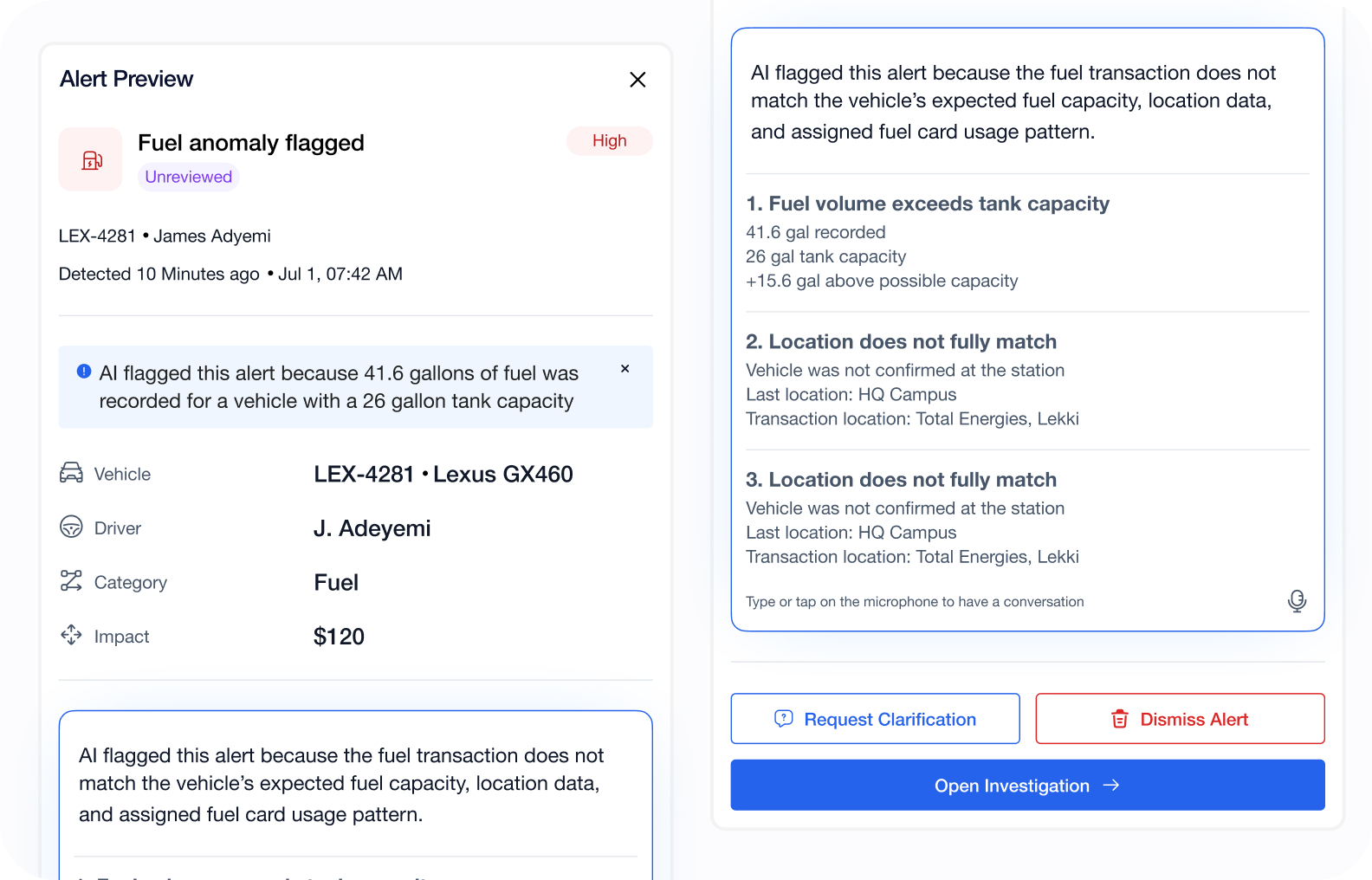
I reframed alerts as hypotheses supported by visible signals. The selected flow combines a prioritised queue with a preview drawer where the operator can inspect why an issue was flagged, review the related entities, ask for further explanation, request clarification, escalate the issue, or dismiss it as a false positive.
A larger standalone investigation page was also explored. It created more space for complex evidence, but introduced depth too early. The drawer-led direction kept investigation close to the queue; a lean deeper page remains an option only if future validation shows that complex cases require it.
Refined, AI presents evidence and uncertainty; the operator decides what the evidence means
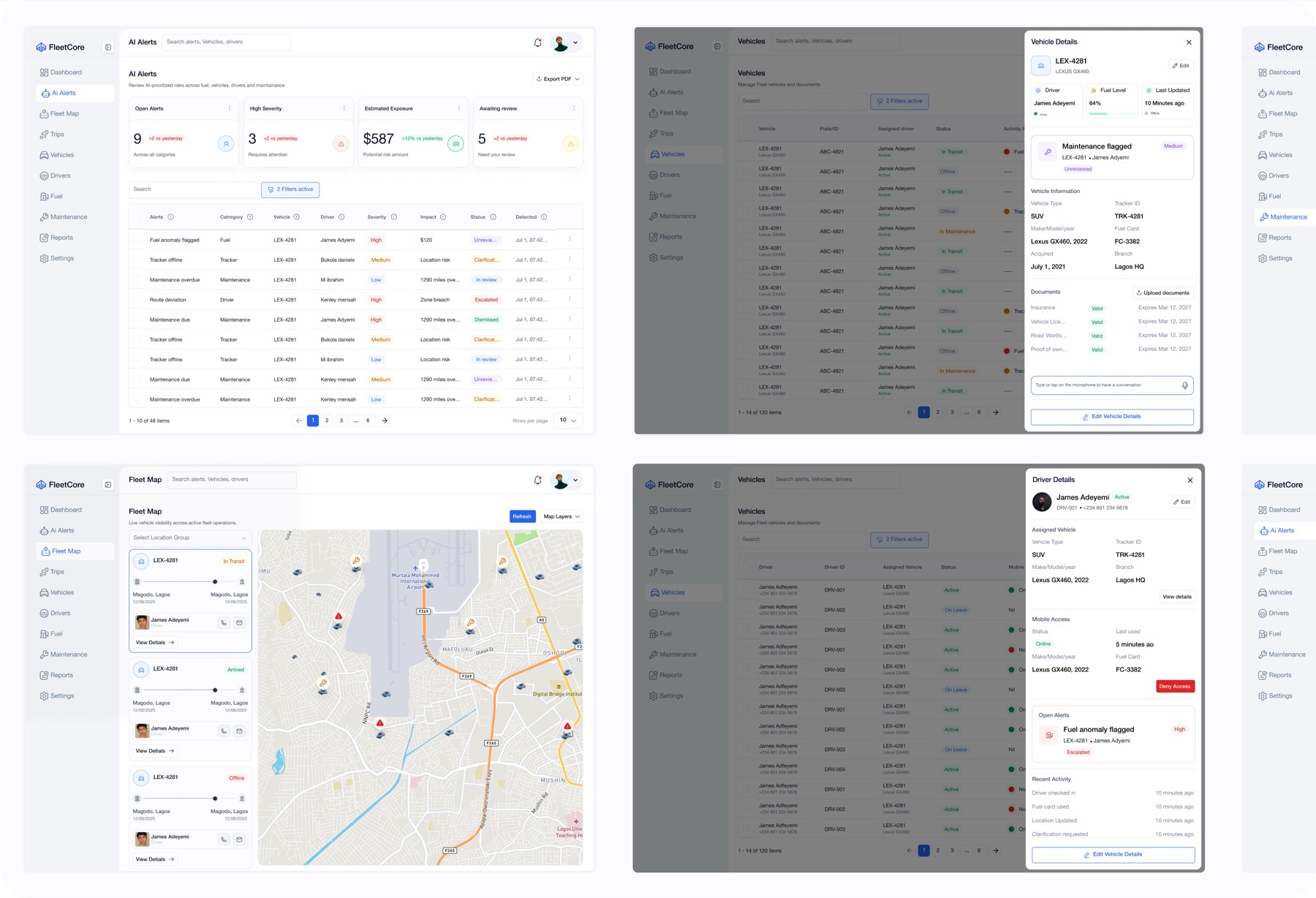
04From page hopping to context-preserving layers
A fleet incident rarely belongs to one entity. Sending the operator to a new page for every vehicle, driver, trip, or maintenance detail would repeatedly break the investigation.
I established one recurring interaction pattern: table, map, or queue → contextual drawer → focused action → confirmation → visible state change.
Drawers preserve the source context while revealing the next level of detail. Focused modals handle consequential actions without turning every task into a new page. Confirmation feedback and updated statuses close the loop by showing that the system received the action.
The same behaviour appears across Fleet Map, Vehicles, Drivers, Maintenance, Trips, and AI Alerts, allowing the operator to learn one interaction language and reuse it throughout the product.
Selected, context remains visible from inspection through action
Bringing the explorations together
The selected direction treats FleetCore as a decision system with connected operational contexts. AI Alerts surfaces issues requiring attention, drawers preserve context, domain actions remain close to the evidence, and the design system keeps those relationships recognisable across the product.
The most meaningful progress came from removing things: equal weight for every module, overconfident AI language, unnecessary full pages, and specialised patterns where a shared behaviour could do the job.
Solution
One alert becomes one continuous operational story.
A fleet manager can enter through the Dashboard and see where attention is required across the operation. Selecting AI Alerts opens a prioritised queue rather than a generic analytics view. Summary cards show open alerts, severity, potential exposure, and items awaiting review, while filters and row states help the manager focus the queue.
Selecting an alert brings its evidence into the same workspace. The preview drawer explains why the issue was flagged and keeps the related vehicle and driver details available, while the wider system provides map, trip, and maintenance context. The operator can ask for further AI assistance, request clarification, escalate the issue, or dismiss it as a false positive.
The dismissal flow asks for confirmation before the alert changes state. It is a small interaction, but it expresses the product's larger position: an AI flag is reviewable, and rejecting it is a legitimate human decision rather than a hidden exception.
If an operational action is needed — requesting a driver update, assigning a mechanic, or changing a work-order state — it happens without losing the original context. Confirmation feedback and visible status changes then show that the action was received.
Dashboard provides orientation, AI Alerts drives investigation, and the entity modules supply the operational context and actions needed to resolve an issue. Trips remains deliberately lightweight, adding movement context without expanding the product into unrelated logistics workflows.
Design system
The screens came second.
Before composing the main product views, I established shared variables, tokens, and reusable component foundations in Figma. I then translated those decisions into components, variants, and repeatable interaction patterns.
The system was built to answer product questions, not only visual ones. What does a selected row promise will happen next? How should warning, critical, review, and resolved states behave across modules? Which actions are primary, secondary, or consequential? How does a drawer reveal more information without severing the operator's context?
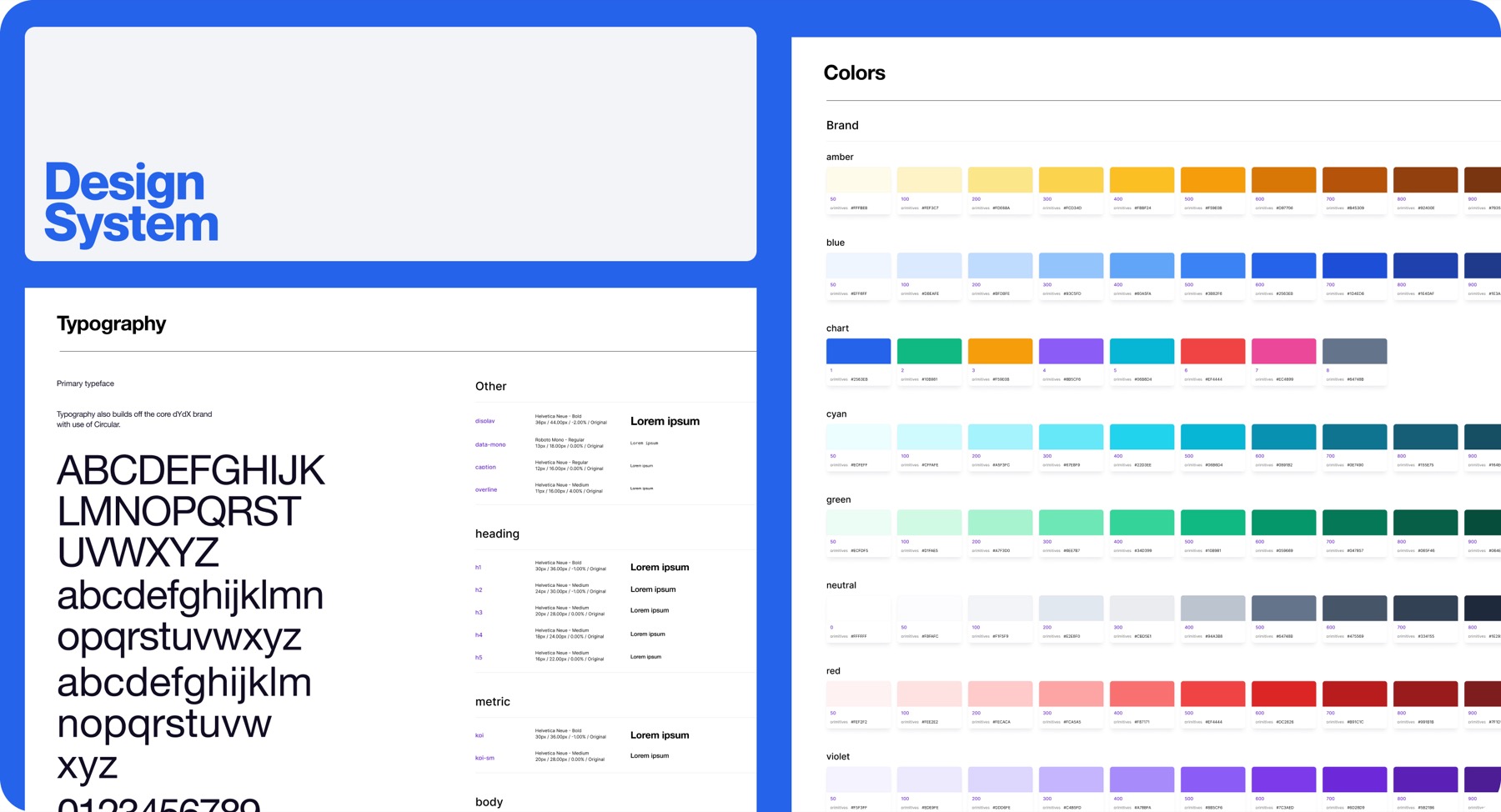
01Foundations
The Figma page separates colour foundations, tokens, typography, and icons from the composed screens. Variables create shared sources for foundational and semantic values so changes can propagate through the components bound to them.
02Components and states
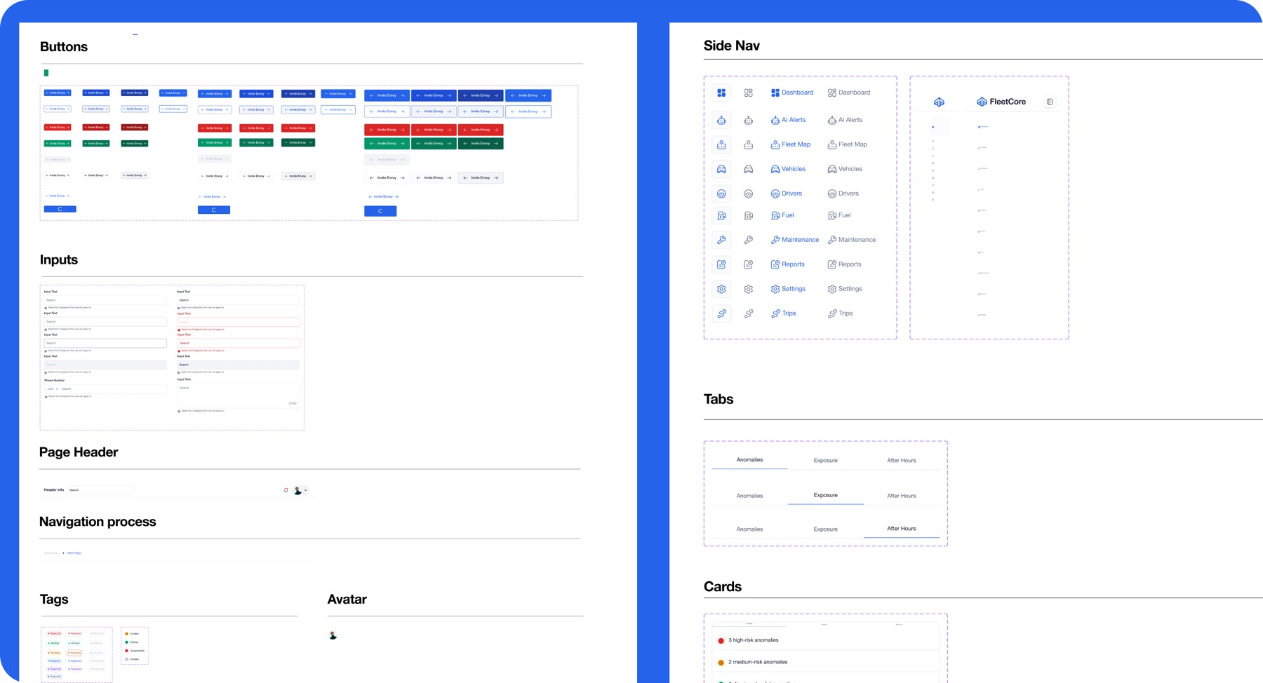
The component inventory covers buttons, inputs, page headers, navigation patterns, tags, avatars, toggles, table cells, notifications, tooltips, icons, and illustrations. A second composed layer applies those parts to side navigation, tabs, cards, and operational tables.
Variants and states carry meaning across contexts. A status should not change meaning because it appears in AI Alerts instead of Maintenance. A selected row should create the same expectation whether it appears in a queue, table, or map-adjacent list. Confirmation and feedback should remain predictable even when the underlying action changes.
03Reusable interaction patterns
The most important reusable asset is not a single component. It is the repeated sequence from selection to resolution: queue, table, or map → drawer → action → modal → confirmation or visible state change.
This sequence provides a stable grammar for AI Alerts, Fleet Map, Vehicles, Drivers, Maintenance, and Trips. Each module can keep its domain-specific content while behaving like part of the same product.
04Composed screens
The current Figma page groups Sign in, Dashboard, AI Alerts, Fleet Map, Vehicles, Drivers, Maintenance, and Trips separately from the foundations. This organisation shows how the current screen families are composed from one shared system.
AI in my workflow
AI expanded the search space. Product judgement made the product smaller.
I used AI to decompose a broad brief, generate operational scenarios, identify edge cases, challenge the information architecture, and accelerate early design-system thinking. It was especially useful for exploring how one alert could affect several entities and for pressure-testing actions, state language, and exception handling.
The first outputs were not automatically the right product answers. AI-assisted directions tended to overbuild the platform, default to generic dashboard patterns, create dense investigation experiences, or express risk with more certainty than the evidence justified.
I evaluated those outputs against the operating model, removed what weakened the workflow, and translated the useful parts into a coherent Figma system. The selected scope, information architecture, interaction patterns, component decisions, screen composition, and human-in-the-loop approach remained design decisions — not automated outputs.
The prototype did not become the product. It revealed the boundaries the product needed.
Reflection
The strongest design move was deciding what the system should not decide.
FleetCore reinforced that consistency is behavioural before it is visual. Shared colours and components matter, but the product presents a repeatable interaction language when the same selection, inspection, action, and feedback relationships recur across different operational contexts. Whether operators find that language easy to learn still needs to be tested.
It also showed me that explainability cannot be added to an AI feature as a final annotation. The language, evidence, controls, dismissal path, and escalation model all have to be designed around uncertainty from the beginning.
The next phase should validate whether operators understand why an alert was raised, which evidence they need before acting, whether a drawer is sufficient for complex investigations, how clarification, escalation, and false-positive dismissal should be recorded, whether map and status states remain understandable at realistic fleet density, how maintenance and trip edge cases affect the shared interaction patterns, and how the desktop workflow connects to organisation-provisioned mobile access.
The design system created consistency across the interface, but the decision model created coherence across the product.